top of page

ABOUT ME
I believe a good design is not only about aesthetics but what’s more important is the message and the belief behind that makes it interesting and touching one’s heart.
Nature's Way Korean Ginseng Packaging
Nature's Way is a company that sells various Korean ginseng products. The client wants a new brand image and packaging design that stands out and differentiate from other traditional Korean ginseng brand.
Service
Identity & Branding, Packaging
Client
Nature's Way Limited

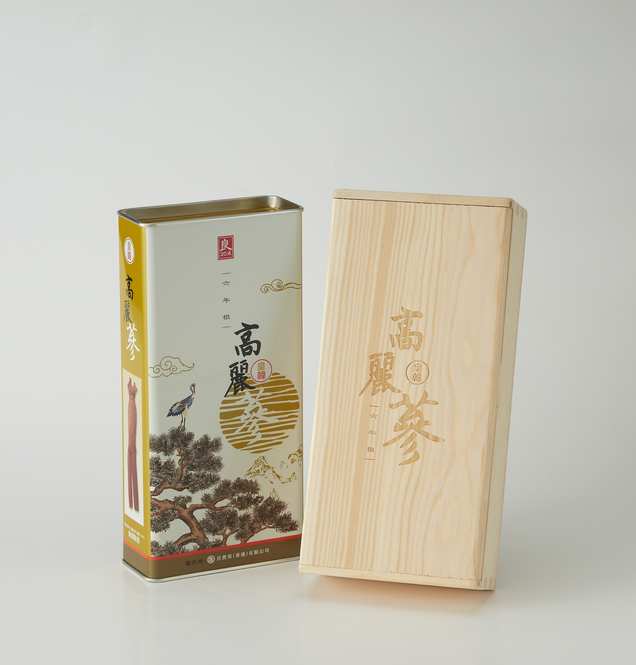
The package design is inspired from Korean Ten Symbols fo Longevity, known as the Ship-Gang-saeng (十長生) .
It includes pine tree, crane, sun, mountain, cloud, water, deer, turtle, ganoderma and peach.

Packaging Design
The traditional packaging design of the Korean Ginseng is a bright red tin can. In comparison to that, we use a light ivory background with olive green and brown to give the brand a simple and elegant look.

bottom of page


